
A Mobile-First World
With the evolution of technology, our daily internet activities have shifted predominantly to mobile devices. For many people, it’s the first thing they check in the morning and the last thing they put down at night. Statistics show that more than half of web traffic comes from mobile devices, making mobile optimization crucial for all businesses, particularly for local, small businesses.
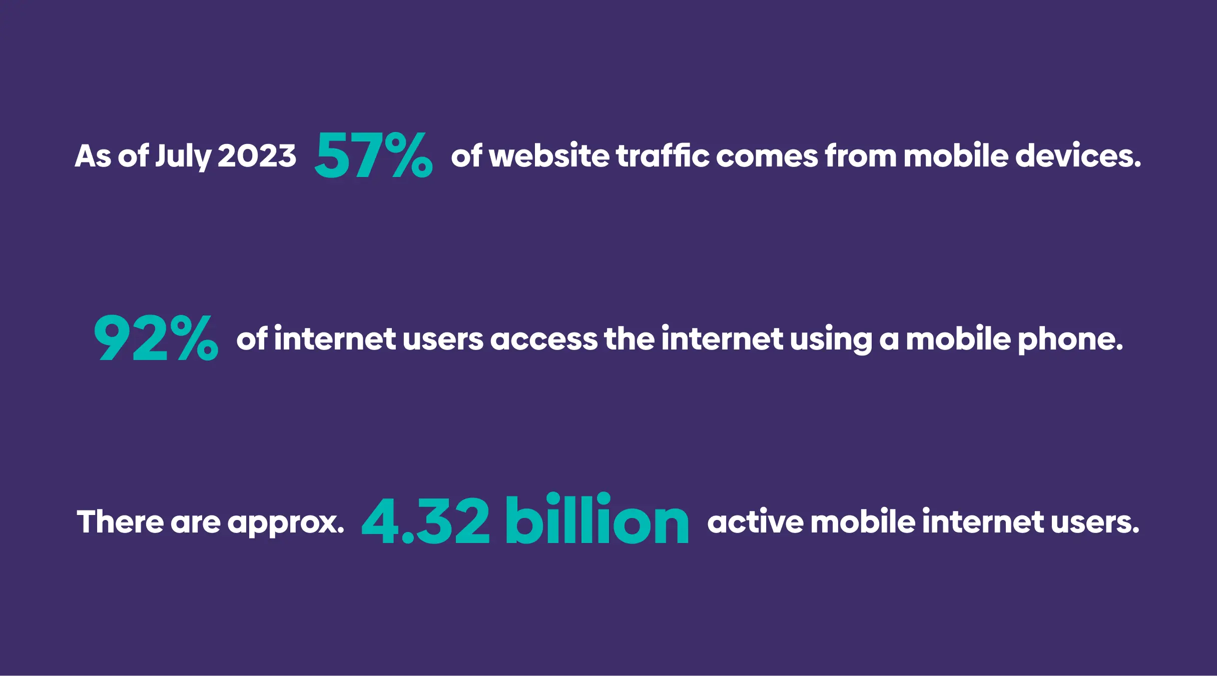 Statistics from https://explodingtopics.com/blog/mobile-internet-traffic
Understanding Mobile Optimization
In simple terms, mobile optimization means making your website easy to use on mobile devices. It’s about providing a seamless and enjoyable experience for visitors, from a responsive design that adjusts to different screen sizes, to simple navigation and fast load times.
The Importance of Mobile Optimization for Small Businesses
Local Searches Lead to Local Sales
Most local searches are conducted on mobile devices. When people are out and about, they use their phones to look for local businesses. A mobile-friendly website gives them the information they need quickly and conveniently, increasing the chances they’ll visit your business.
Improved Search Engine Ranking
Search engines like Google prioritize mobile-friendly websites in their search results. In fact, Google uses mobile-first indexing, which means it predominantly uses the mobile version of the content for indexing and ranking. If your site isn’t mobile-optimized, it could hurt your search engine ranking, making it harder for potential customers to find you online.
Better User Experience
Mobile optimization ensures that your website is easy to navigate on a smaller screen, has quick load times, and functions well. This leads to a better user experience, which can improve visitor satisfaction, increase the time they spend on your site, and ultimately lead to higher conversion rates.
How to Optimize Your Website for Mobile
Responsive Web Design
Responsive web design allows your website’s layout to adjust to the screen size and orientation of the device. It ensures your website looks good on all devices, from smartphones and tablets to laptops and desktops.
Easy Navigation
A mobile-friendly site has simple and intuitive navigation. Links and buttons should be large enough to tap, and there should be plenty of space between clickable elements to avoid accidental clicks.
Fast Load Times
Mobile users expect quick load times. Compress images, minimize code, leverage browser caching, and reduce redirects to increase your site’s loading speed.
Takeaway
The need for mobile optimization can’t be overstated. It’s not just a nice-to-have, but a must-have for small businesses in the digital age. By optimizing your website for mobile, you can reach more customers, improve your search engine ranking, and provide a better user experience, all of which can contribute to your business growth. Are you ready to optimize your website for mobile? Click here for a free quote.